WorkSpan Redesign
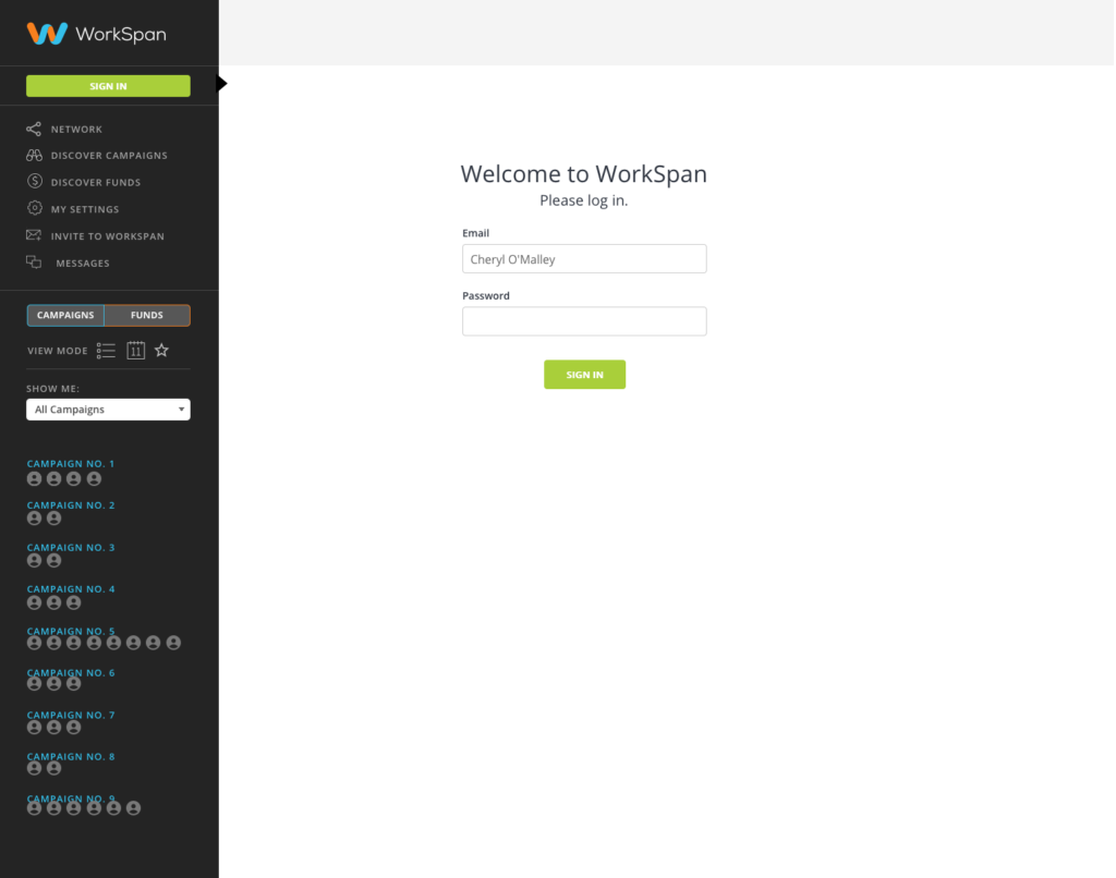
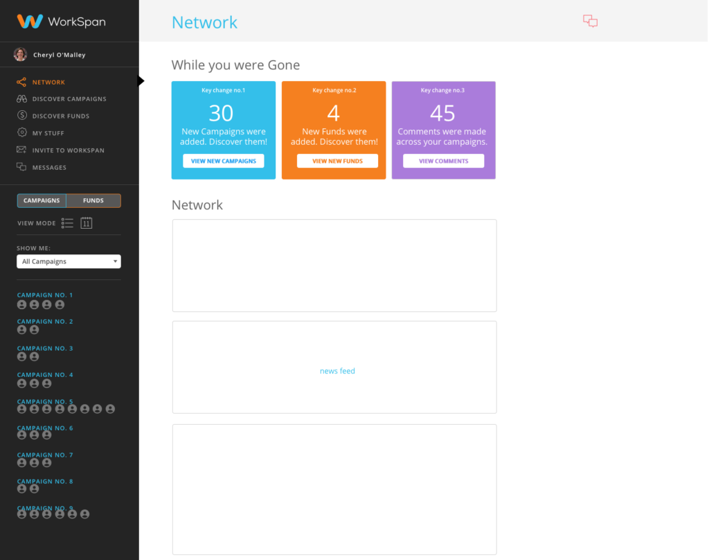
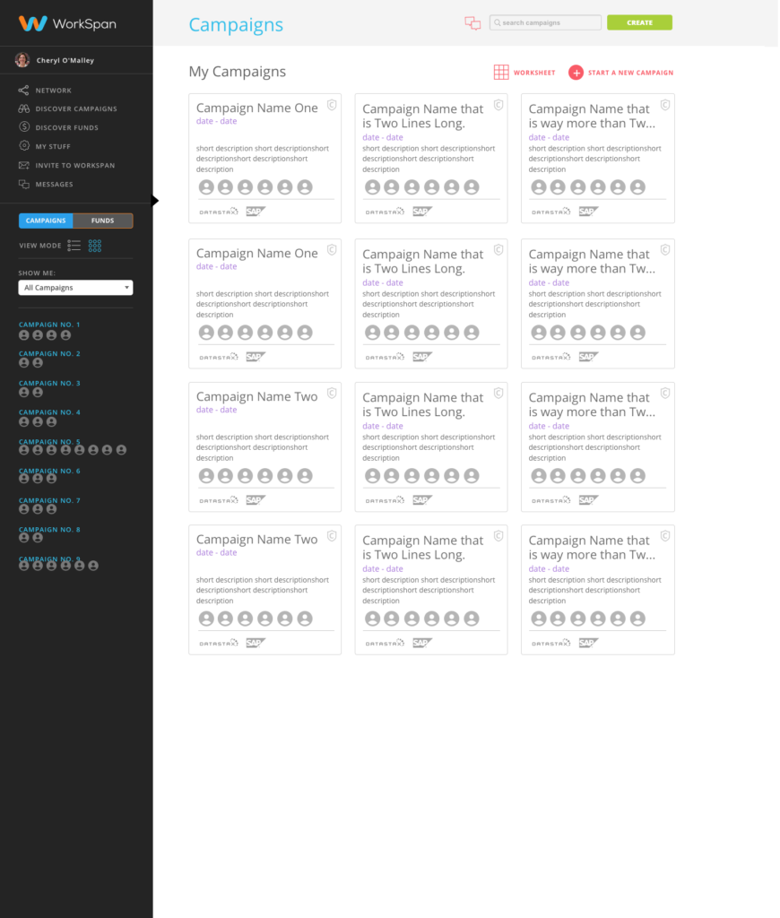
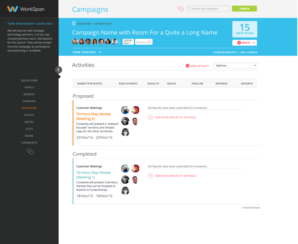
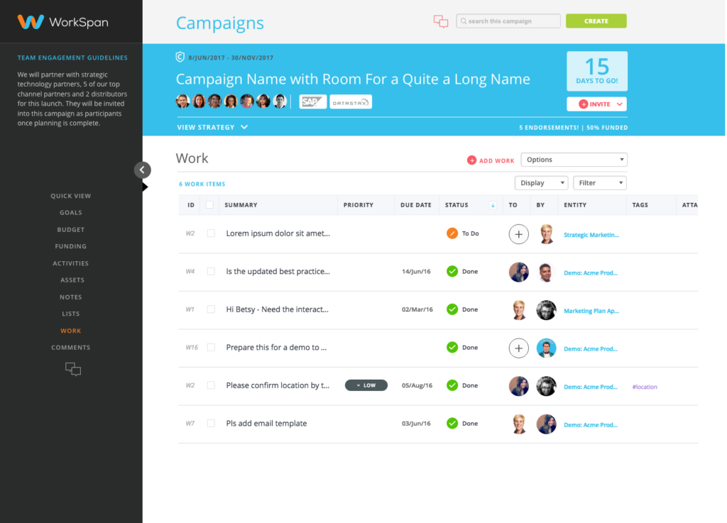
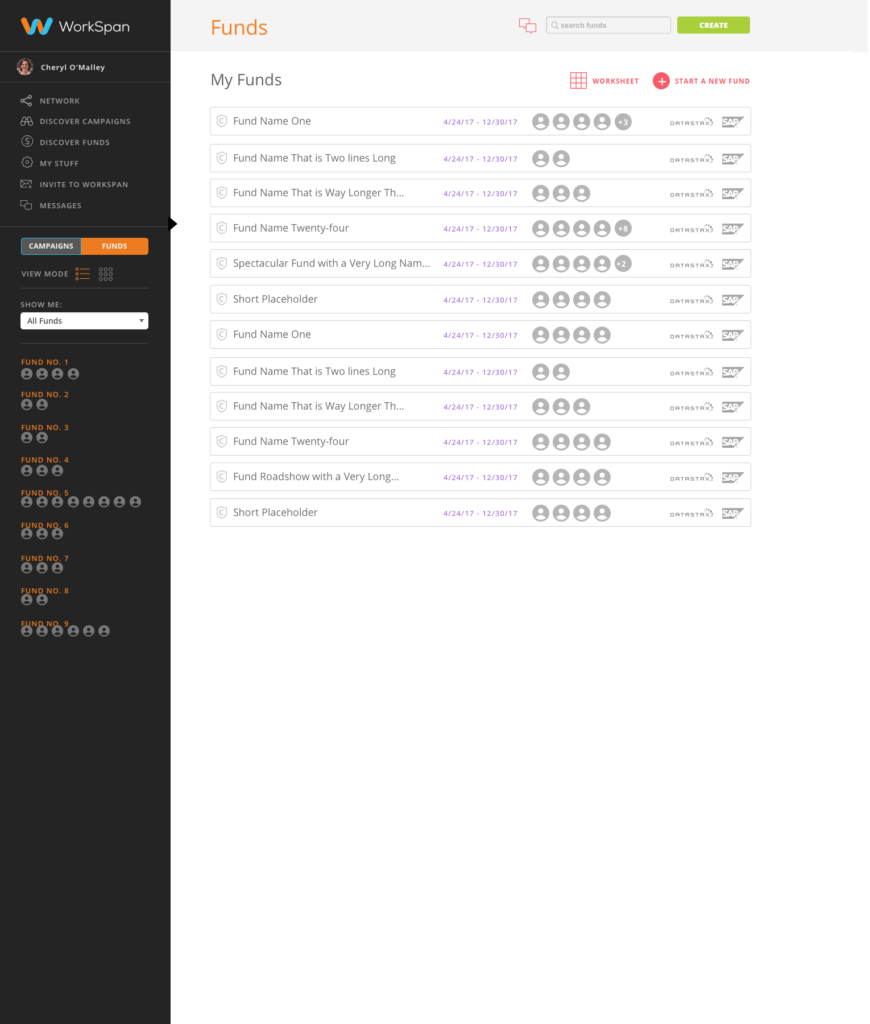
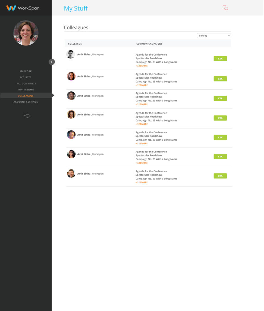
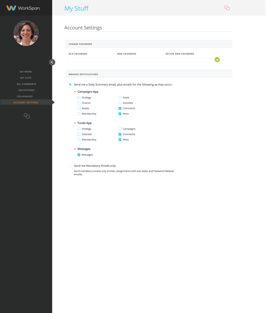
While at WorkSpan, I saw an opportunity to tighten up the landing page and improve the user experience. This was my unique design, which was a departure from the established branding, while maintaining many of the original styles, such as fonts and colors.
user experience | visual DESIGN
